The Challenge
A clear expectation
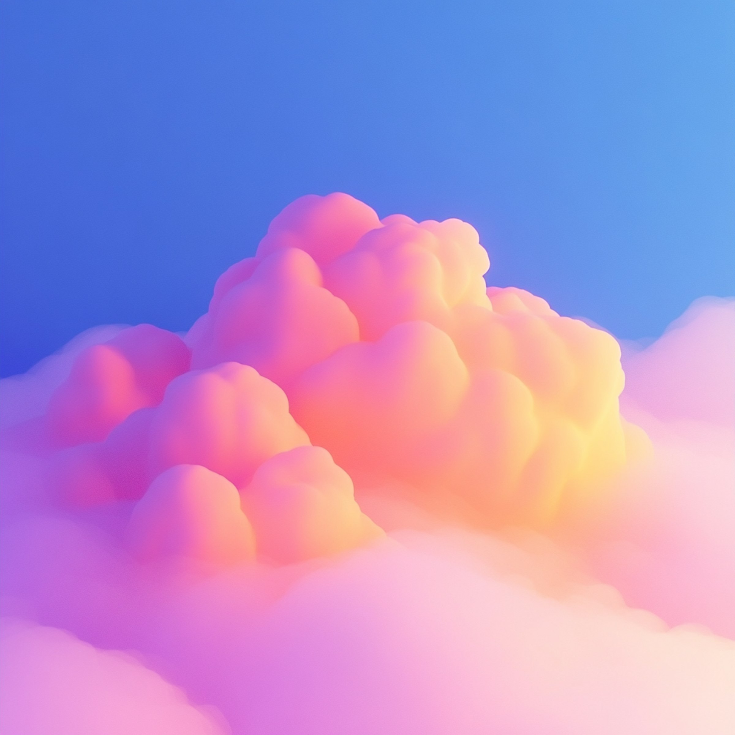
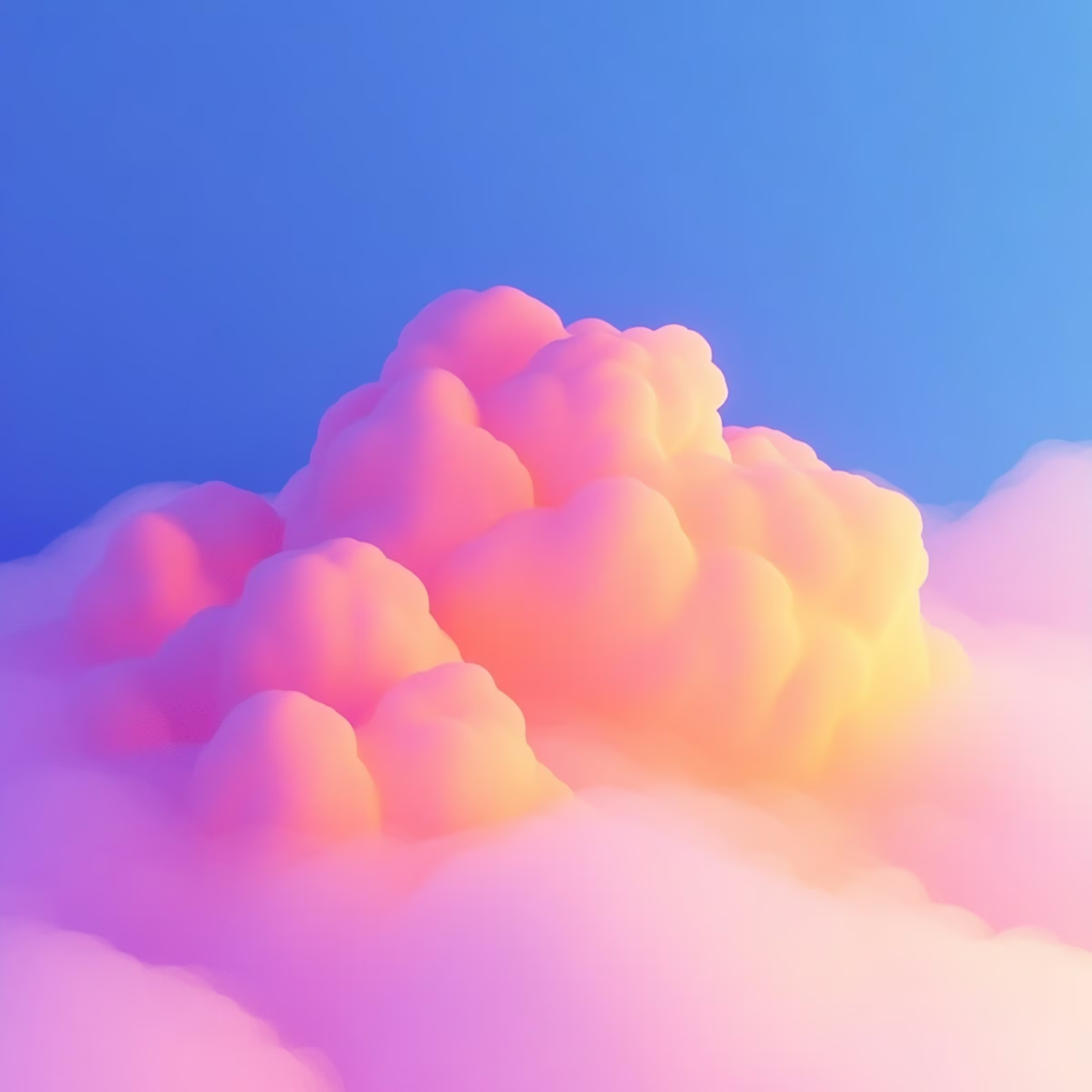
Natural Line came to us with a clear expectation: a beautiful online presence that feels organic, modern, and visually aligned with their nature-focused brand. But there was a deeper challenge behind the aesthetics: how do we translate strong visual design into a functional funnel that actually converts?
Their audience is highly visual and emotionally driven, so the site had to inspire trust and connection—but still lead users clearly through decision-making pathways.
The site wouldn’t be static either. Natural Line wanted an iterative setup—a foundation we could build upon, test, and refine continuously based on real user behavior and campaign feedback.
Our Approach
Merging Brand and Performance
We started by mapping out the key customer journeys—from awareness to consideration to action. Then, we worked section by section to design a layout that not only looked stunning but also guided users toward specific actions:
- Clear value propositions placed early
- Scrollable, modular design for product discovery
- Embedded trust signals like social proof, results, and brand values
Each visual choice (from font to layout to imagery) was made not just for beauty, but for strategic clarity.
Funnel-Driven Structure
We didn’t just build one website—we developed a system of conversion funnels:
- Landing pages tailored to specific campaigns and ad groups
- Dynamic sections that we could A/B test based on performance
- Contact and booking flows designed to reduce drop-off and capture intent early
These funnels allow us to match messaging to mindset, delivering content that fits the customer’s stage in the journey.
Ongoing Optimization
From the start, this project was meant to evolve. We use analytics, heatmaps, and campaign feedback to constantly ask:
- Are people scrolling past key value points?
- Which sections keep attention, and which cause drop-off?
- How do ad landing pages perform compared to the homepage?
This gives us the clarity to change what’s not working—whether it’s content, placement, or visual hierarchy—and double down on what is.
The Outcome
Natural Line now has a visually expressive and strategically functional Webflow website that supports:
- High-impact storytelling through design
- Conversion-oriented user flows that are always being refined
- Campaign-specific landing pages that help us test, learn, and improve with every visitor
It’s not just a website—it’s a growing system to support the brand’s visibility and growth.
What We Learned
Design without conversion is decoration.
Our job was to make beauty work harder—for both the user and the business.
Funnels aren’t just for ads—they’re for structure.
Every section should lead somewhere. Every visual should support decision-making.
A website is never finished.
Continuous testing and iteration are what keep it relevant and high-performing.